Charts and graphs can communicate data; Infographics turn data into information
Friday, September 28, 2007
The Wine Advocate Vintage Guide
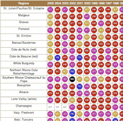
From eRobertParker.com, the online Wine Advocate Vintage Guide. Fascinating guide of wines from 1970-2005. Wines are grouped by region and year, and each group is scored and given a letter code to identify the current maturity status of those wines (like Ready to Drink, Too Old and Early Maturing). The color coding represents ranges of the numeric scores.
The guide is interactive, so clicking on any of the rating circles brings you to a list of the specific wines grouped together for that region. For the specific wines, you can see their individual name, score, maturity level and price range.
A PDF version of the guide is available here for download.
Travel Time Maps

From mySociety.org, time travel maps take into consideration the means of travel (car, rail, etc.) and the different paths available. Above is a map of London and shows time to travel from the center of town. The white contour lines represent half hour intervals, and the color coding has warm colors for the shortest times, and cool colors for the longest times.
The really interesting feature are the "islands". These small circles represent destinations that you can reach much faster than the surrounding area. Mainly stations for faster trains than have fewer stops.
Strangely similar in concept to an "event horizon".


ليست هناك تعليقات:
إرسال تعليق